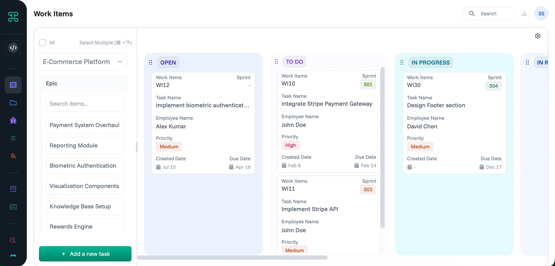
A Group Detail interface gives your team a structured way to view records organized by meaningful groupings — displayed as a board with named columns and nested sections. Use it when you need to see data at multiple levels at once, track work across statuses, and drill into subgroups without leaving the interface.
Create a Group Detail interface
Click the + Add New button in the sidebar, then select Group Detail from the "Create a New" panel.
This opens the New Interface dialog, which walks you through three steps: Essentials, Additional, and Permissions.
Note: All these settings are configured by admins and cannot be accessed by any other roles.
Step 1 — Essentials
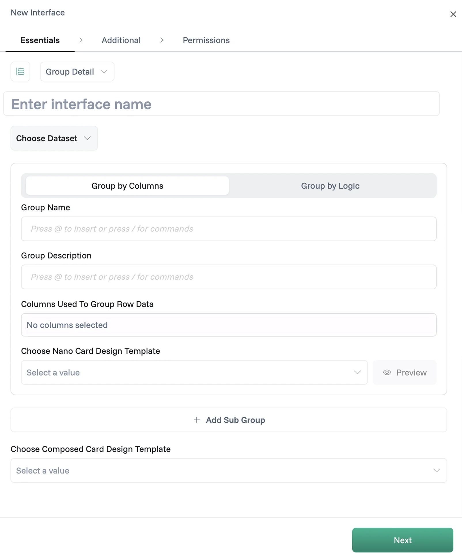
Enter Interface name — give your interface a name so your team knows what it's for.
Choose Dataset — select the data source your Group Detail interface will display and manage.
Icon (optional) — choose an icon that best represents what this Group Detail interface is about, then pick a color from the preset palette.
Configuring the Main Group
Once you select a dataset, configure how rows are grouped. Choose one of two methods:
Group by Columns — groups rows based on values in one or more columns from your dataset; for example, grouping work items by Status creates columns like Open, To Do, In Progress, and In Review.
Group by Logic — define custom logic rules to control how rows are grouped for more advanced use cases.
Then fill in the following fields:
Group Name — the display name for your main group. Press
@to insert column references directly into the name; you can add more than one column.Group Description (optional) — a short description shown alongside the group.
Columns Used to Group Row Data — automatically populated as column tags when you add column references to the Group Name.
Nano Card Design Template (optional) — choose a card design template that controls how individual row cards look inside each group column. Click Preview to see how the card will appear before saving.
Adding Subgroups
Click + Add Sub Group to add a nested level of grouping beneath the main group. This is useful when your data has a natural hierarchy — for example, grouping first by Epic, then by Task Name within each epic.
You can add more than one subgroup. Each subgroup has its own set of fields:
Subgroup Title (required) — works the same as Group Name. Press
@to insert column references directly into the title; you can add more than one column.Subgroup Description (optional) — a short description for this subgroup.
Subgroup Name — an internal name used to reference this subgroup.
Show Only Existing Data for Subgroup — when enabled, this toggle filters the subgroup to show only rows where data already exists, hiding empty entries.
Columns Used to Group Sub-Row Data — automatically populated as column tags when you add column references to the Subgroup Title.
Nano Card Design Template (optional) — apply a card template to control how sub-row cards are displayed.
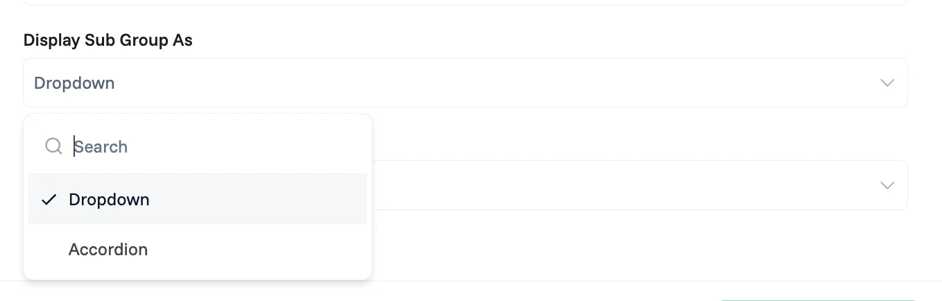
Display Sub Group As — choose how the subgroup is rendered in the interface:
Dropdown — the subgroup appears as a collapsible dropdown section.
Accordion — the subgroup appears as an expandable accordion panel.
To remove a subgroup, click the delete icon on the top right corner of the subgroup panel.
Composed Card Design Template (optional)
At the bottom of the Essentials tab, you can attach a Composed Card Design Template — a custom layout built in the Designer that controls which fields are visible, disabled, or hidden per role when a record is opened. Learn more in the Designer guide.
Click Next to continue.
Step 2 — Additional
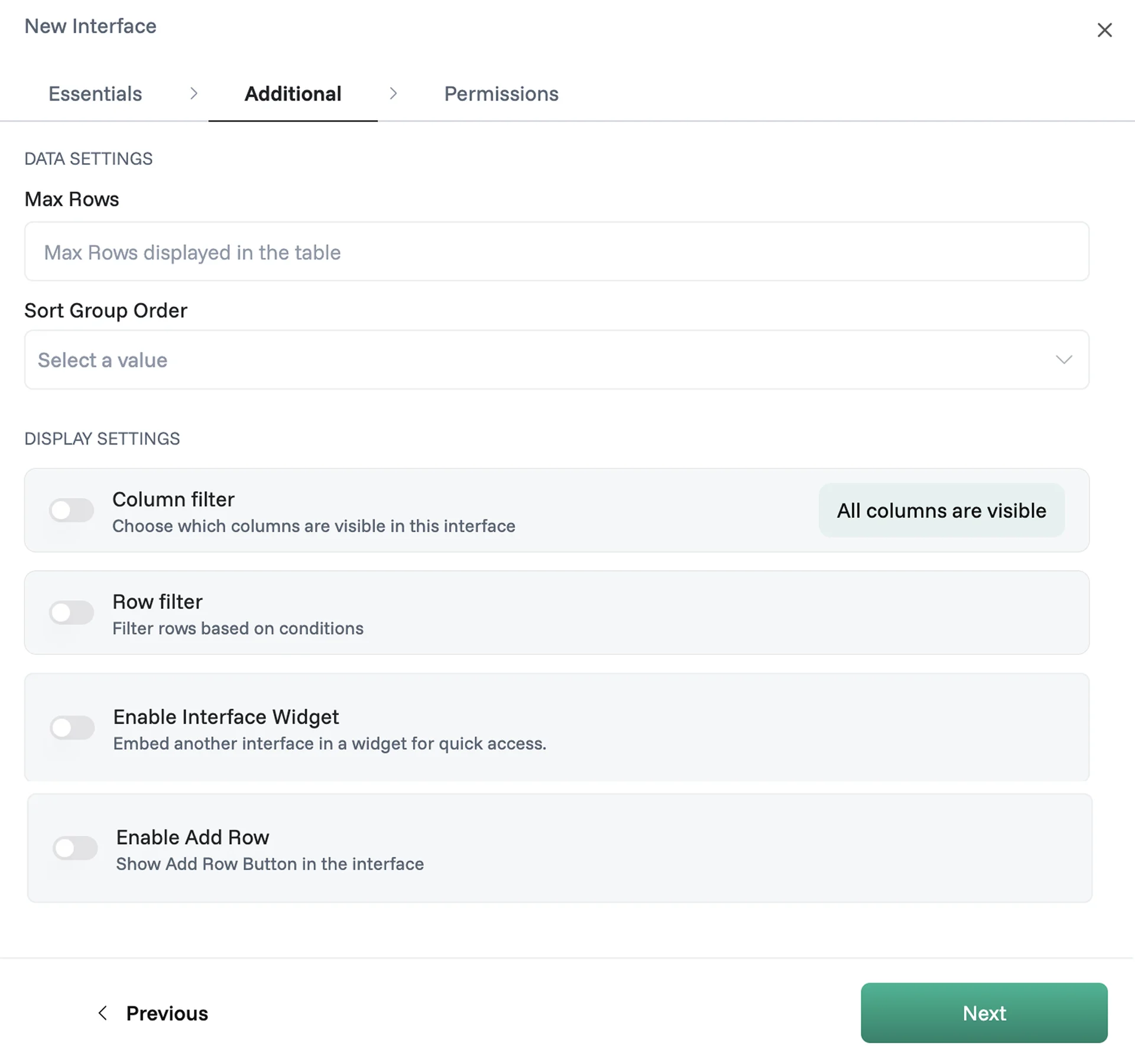
Data Settings
Max Rows — sets how many records the interface loads at once.
Sort Group Order — choose the order in which group columns are arranged when the interface first loads.
Display Settings
Column filter — when enabled, choose which columns are visible in this interface; not every column needs to be shown, so focus on what's relevant for this interface's purpose.
Row filter — when enabled, set conditions that automatically limit which rows appear using the visual logic builder; for example, "Assigned To equals Logged in User" shows each person only their own records. Learn more in the Logic Composer guide.
Enable Interface Widget — when enabled, embed another interface as a widget for quick access directly within this interface.
Enable Add Row — when enabled, shows an add button so users can create new records directly from the interface.
Click Next to continue.
Step 3 — Permissions
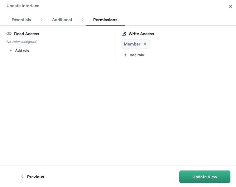
Read Access — assign which roles can view this interface; if no roles are assigned, everyone in the workspace can see it, but once a role is added only that role has access.
Write Access — assign which roles can add, edit, or delete records in this interface.
Click Update View to save your interface.
Working with your Group Detail interface
Once your interface is live, your team sees the dataset displayed as a grouped board.
1. Filter by group
The left panel lists your subgroup categories each with a searchable list of values. Select one or more values to narrow down which records appear on the board.
2. Search
Use the search bar in the top right to find records instantly by keyword across the interface.
3. Export
Click the download icon next to the search bar to export your data as a CSV or Excel file. The export reflects your current filters and selections — what you see is what you get.
4. Add a new record
Click + Add Row (or label you've set) at the bottom of the left panel to create a new record directly from the interface.
6. Connected Datasets
Click the settings icon (⚙️) in the top right of the Edit Row panel to open the Connected Datasets panel. From here, select which views from related datasets appear as tabs.