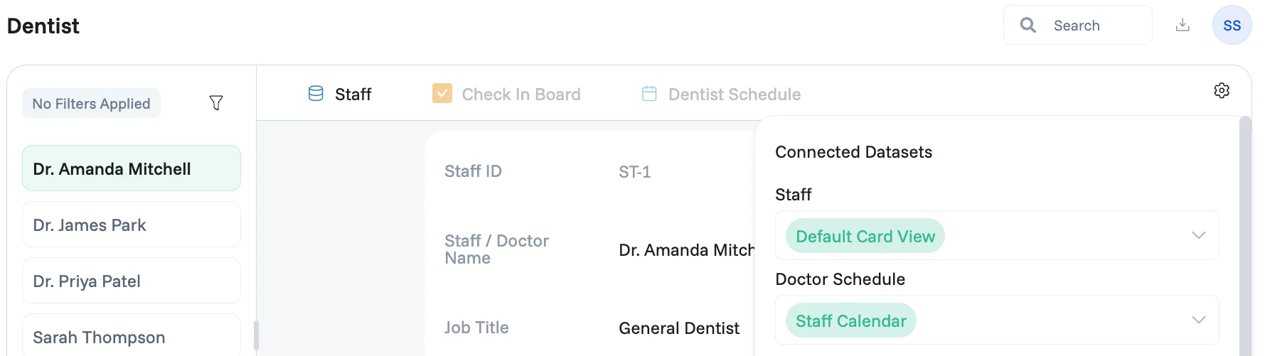
A List Detail interface gives your team a quick way to find and review individual records in depth. Select any record from the list and its full details load immediately, all without leaving the page.
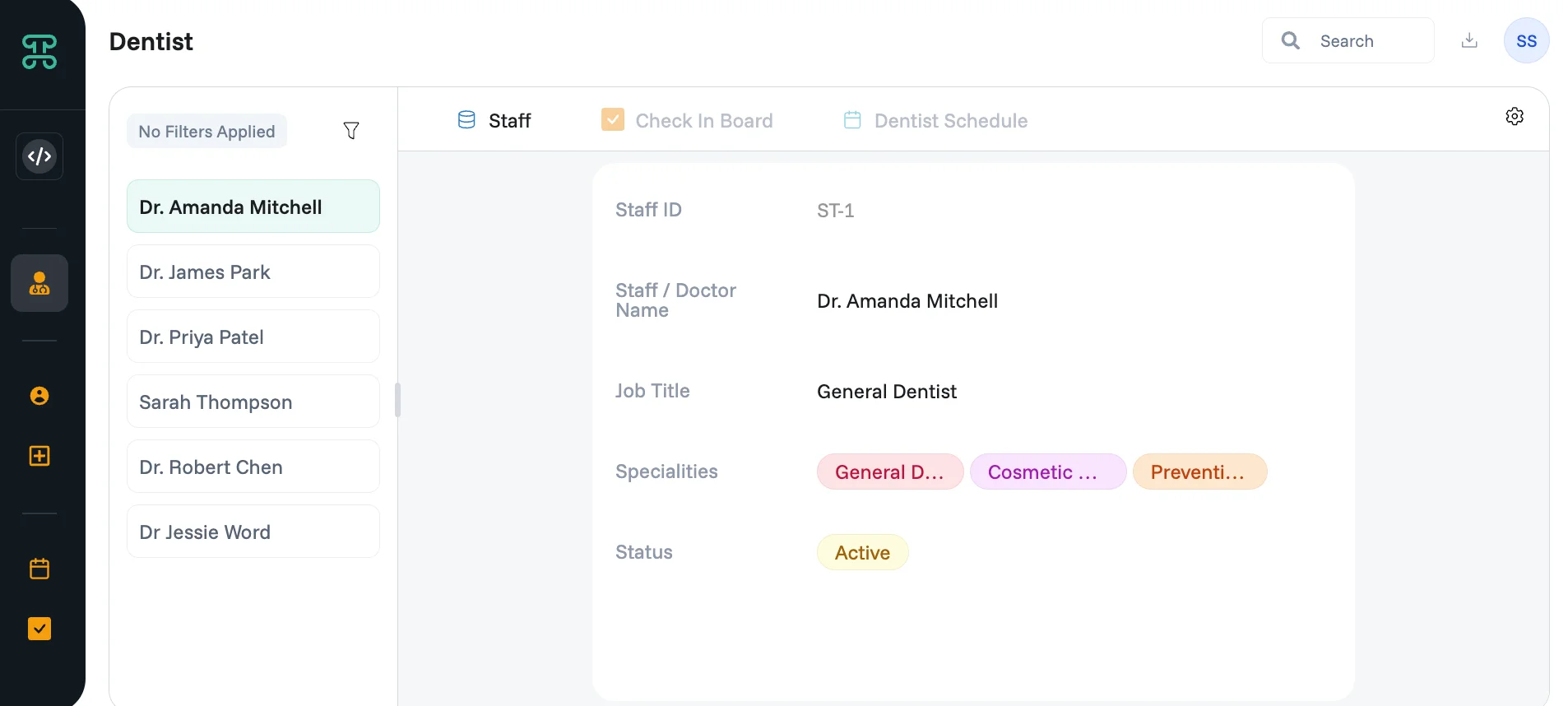
Create a List Detail interface
Click the + Add New button in the sidebar, then select List Detail from the "Create a New" panel.
This opens the New Interface dialog, which walks you through three steps: Essentials, Additional, and Permissions.
Step 1 — Essentials
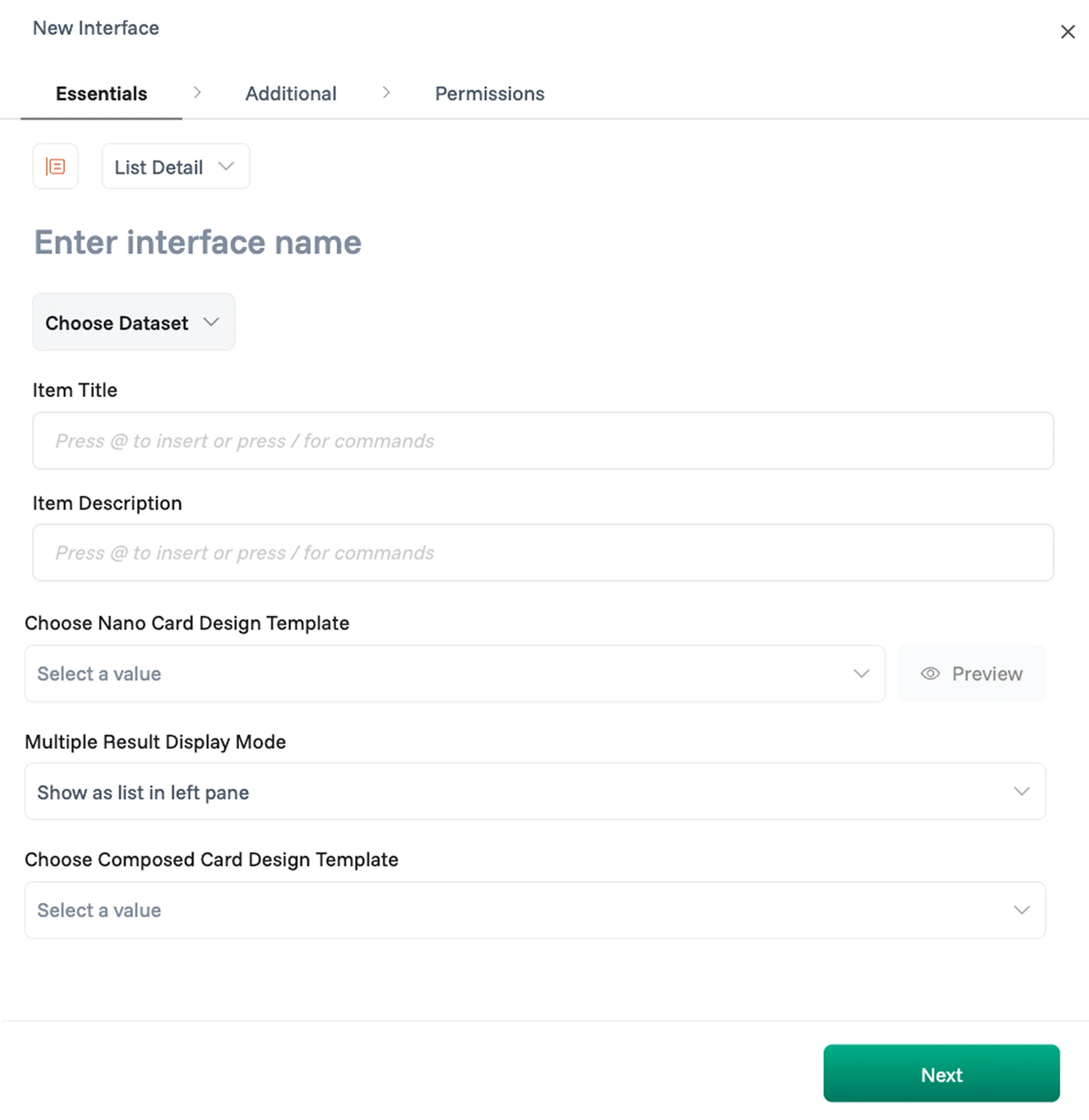
Enter Interface name — give your List Detail interface a name so your team knows what it's for.
Choose Dataset — select the data source your interface will display.
Item Title — choose the field that will appear as the label for each record in the list. This is typically the name or identifier field of your dataset.
Item Description (optional) — choose a secondary field to display beneath the title in each list item, giving users a quick summary before they open the full detail.
Choose Nano Card Design Template (optional) — attach a custom card layout built in the Designer that controls how each item appears in the list. Click Preview next to the dropdown to see how the card will look before applying it.
Multiple Result Display Mode — controls how the panel behaves when more than one record is available. The default is Show as list in left pane, but you can choose from:
Show as list in left pane — the standard split-screen view; users select an item from the left list to view its details on the right.
Show single card with previous/next — displays one record at a time with navigation arrows to move between records.
Only show first result — always displays the first matching record in the detail panel.
Only show last result — always displays the most recent matching record in the detail panel.
Choose Composed Card Design Template (optional) — attach a custom layout built in the Designer that controls which fields are visible, disabled, or hidden per role when a record is opened in the detail panel. Learn more in the Designerguide.
Click Next to continue.
Step 2 — Additional
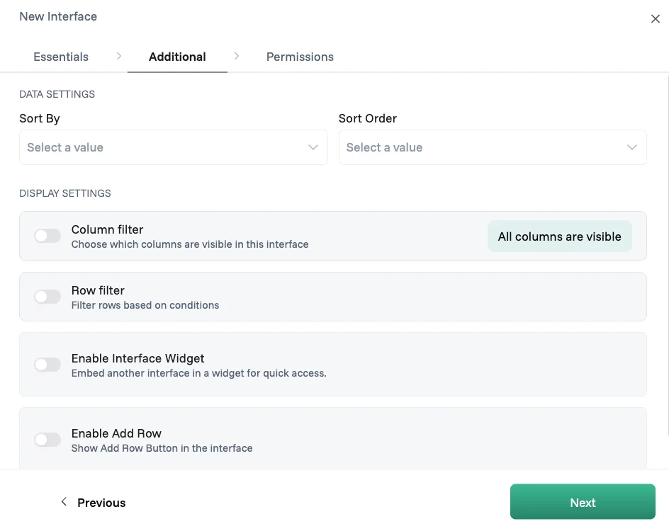
Data Settings
Sort By — choose which column the list is ordered by when the interface first loads.
Sort Order — set whether records appear in ascending or descending order.
Display Settings
Column filter — choose which fields are visible in the detail card; focus on what's relevant for this interface's purpose.
Row filter — set conditions that automatically limit which records appear in the list, using the visual logic builder. For example, "Status equals Active" shows only active records. Learn more in the Logic Composer.
Enable Interface Widget — attach a Form interface built on the same dataset, so users add new records through a customized form instead of the default row input; unlike Add Row, a form lets you hide fields, set default values, and control the layout. Learn more in the Form Interface.
Enable Add Row — shows an add button in the interface so users can create new records directly.
Click Next to continue.
Step 3 — Permissions
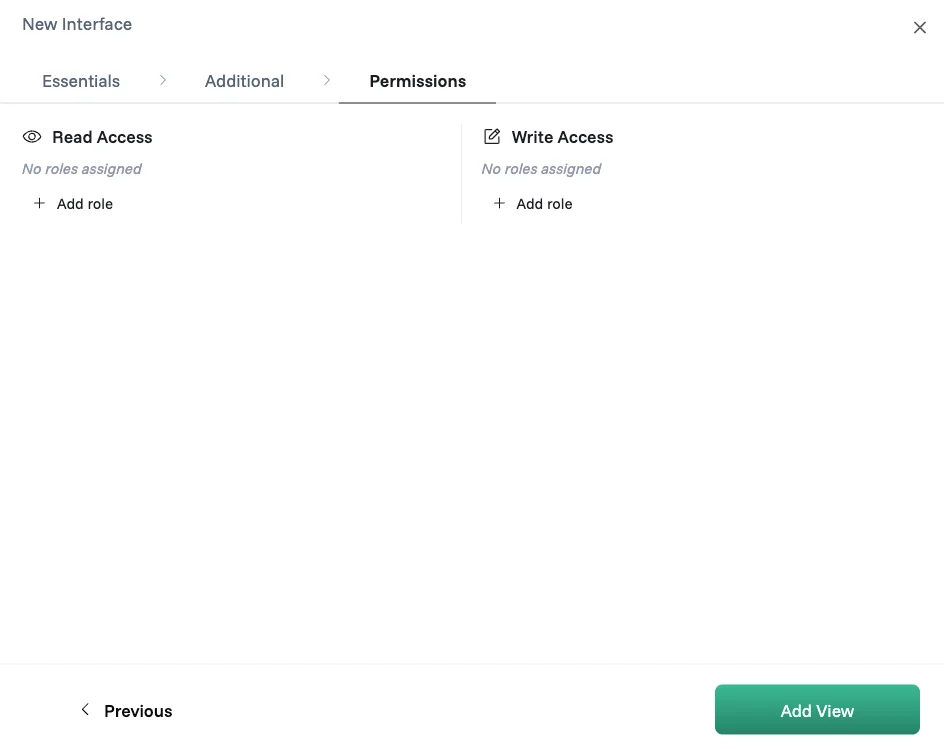
Read Access — assign which roles can view this interface; if no roles are assigned, everyone in the workspace can see it, but once a role is added only that role has access.
Write Access — assign which roles can add, edit, or delete records in this interface.
Click Update View to save your interface.
Note: These settings are configured by admins and cannot be accessed by any other roles.
Working with your List Detail interface
Once your interface is set up, it opens in the display mode you configured. Records are presented as detail cards showing all the fields for each entry, and how you navigate between them depends on the Multiple Result Display Mode you chose during setup.
1. Slice your data
The filter panel on the left lets you narrow down which records appear in the list. Select one or more values to filter by a column — such as Status, Job Title, or Speciality — and combine filters across columns for a more precise view. Click + Add Slice to create a custom filter using the Logic Composer and save it as a reusable slice.
2. Quick filters
Quick filters sit above the list as tabs, giving you one-click access to common views without touching the filter panel.
Show All — removes all active filters and shows every record.
New — shows records created within the last N days; you set the day range in Manage Quick Filters.
Active — shows records modified within the last N days; you set the day range in Manage Quick Filters.
Mine — shows only records where you are included as a team member.
To toggle which quick filters are visible or adjust their day ranges, click the filter icon next to the tabs to open Manage Quick Filters.
Click + next to the tabs to create a custom filter using the Logic Builder. Combine multiple conditions with AND/OR logic and save them as a named tab for repeated use.
3. Search
Use the search bar in the top right to find records instantly by keyword across your list.
4. Export
Click the download icon next to the search bar to export your data as a CSV or Excel file. The export reflects your current filters — what you see is what you get.
5. Viewing a record
Each record opens as a detail card displaying all the fields configured for this interface. The detail card uses the Default Card View by default, which shows all visible fields in a clean, readable layout — or a custom Design Template if one was applied during setup.
6. Changing the card view with Connected Datasets
Click the settings icon ⚙ in the top-right of the Edit Row panel to open the Connected Datasets panel. From here, select which views from related datasets appear as tabs. For example, a Staff dataset might offer a Default Card View for the staff record details, while a linked Doctor Schedule dataset can be switched to a Staff Calendar view to show the dentist's appointments in a calendar layout.
This allows you to tailor how related data is presented for each connected dataset without leaving the interface.