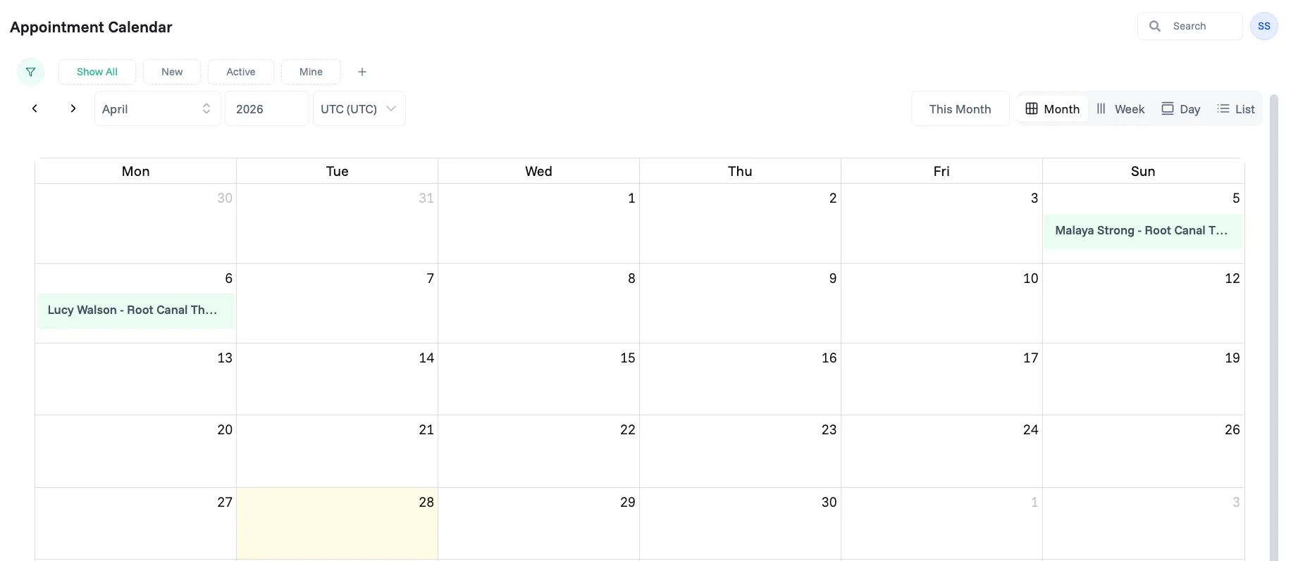
A Calendar interface gives your team a visual, time-based way to view and manage records from a dataset. Use it when your team needs to see when things are scheduled — appointments, tasks, deadlines, or events — laid out across days, weeks, or months instead of rows in a table.
Create a Calendar interface
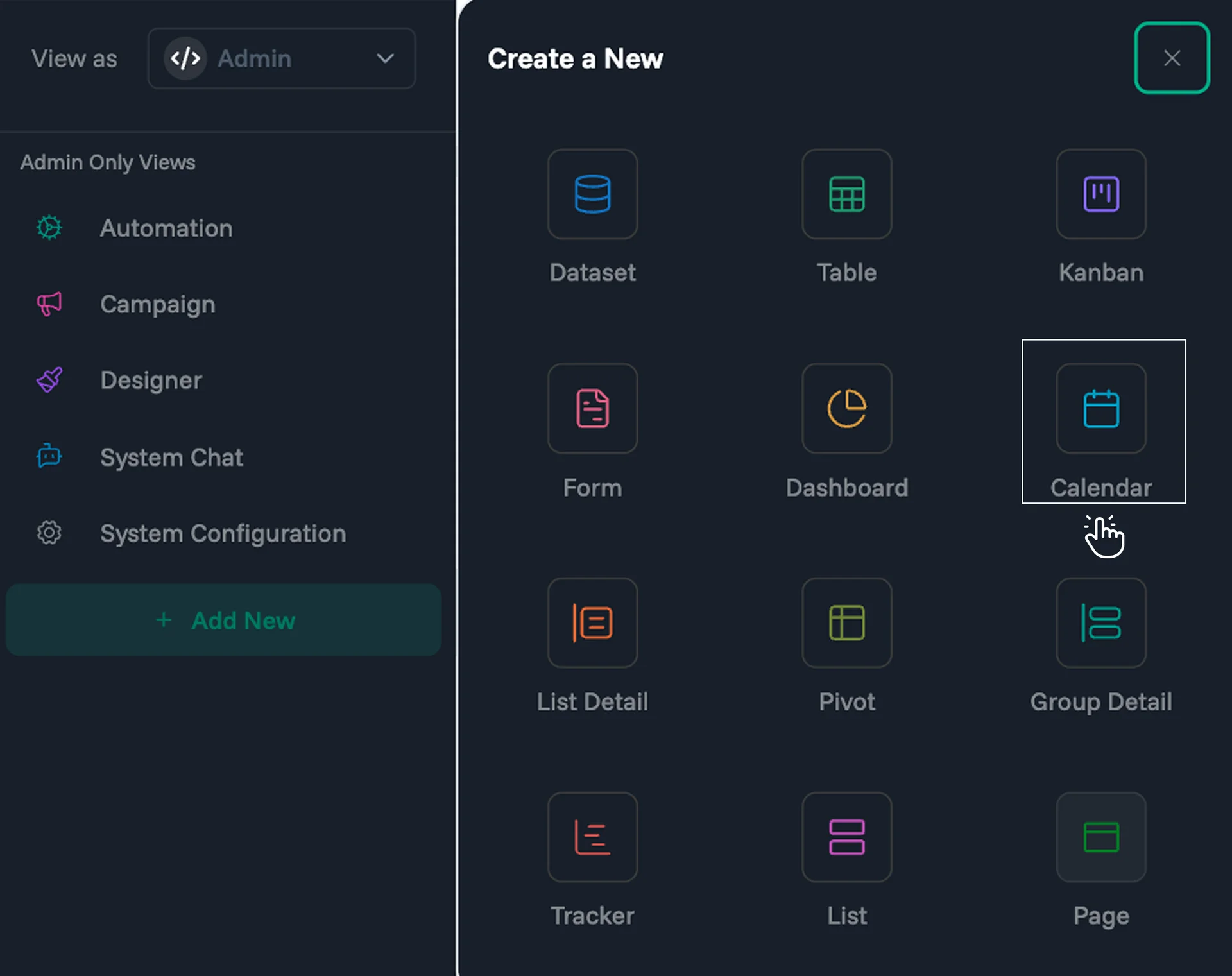
Click the + Add New button in the sidebar, then select Calendar from the "Create a New" panel.
This opens the New Interface dialog, which walks you through three steps: Essentials, Additional, and Permissions.
Step 1 — Essentials
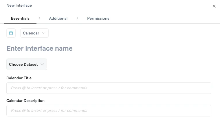
Icon (optional) — choose an icon that best represents this calendar interface, then pick a color from the preset palette.
Enter Interface name — give your calendar a name so your team knows what it's for.
Choose Dataset — select the data source your calendar will display and manage.
Calendar Title — type your title text and use @ to insert column names from your dataset inline. For example, typing
@Patient Name - @Procedurepulls those field values to build the event label shown on each calendar card.Calendar Description — compose a description the same way, using @ to reference column names that add supporting detail to each event card.
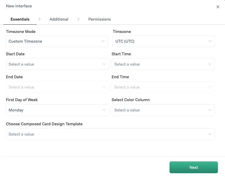
Timezone Mode — controls how dates and times are displayed across the calendar. Choose from three options:
Custom — locks the calendar to a specific timezone you choose, regardless of where each viewer is located.
Local — displays events in each viewer's own device timezone, so everyone sees times adjusted to where they are.
Organization — displays events in the timezone set at the workspace level, keeping all team members on the same reference time.
Timezone — available when Custom Timezone is selected. Choose from the full list of world timezones to set the timezone all dates and times will be shown in.
Start Date — select the dataset column that holds each record's start date.
Start Time — select the dataset column that holds each record's start time.
End Date — select the dataset column that holds each record's end date.
End Time — select the dataset column that holds each record's end time.
First Day of Week — choose which day your calendar week begins on (e.g. Monday or Sunday).
Select Color Column — choose a column whose values control the color of each event on the calendar, making it easy to distinguish records at a glance.
Choose Composed Card Design Template (optional) — attach a custom layout built in the Designer that controls which fields are visible, disabled, or hidden per role when a record is opened. Learn more in the Designer guide.
Click Next to continue.
Step 2 — Additional
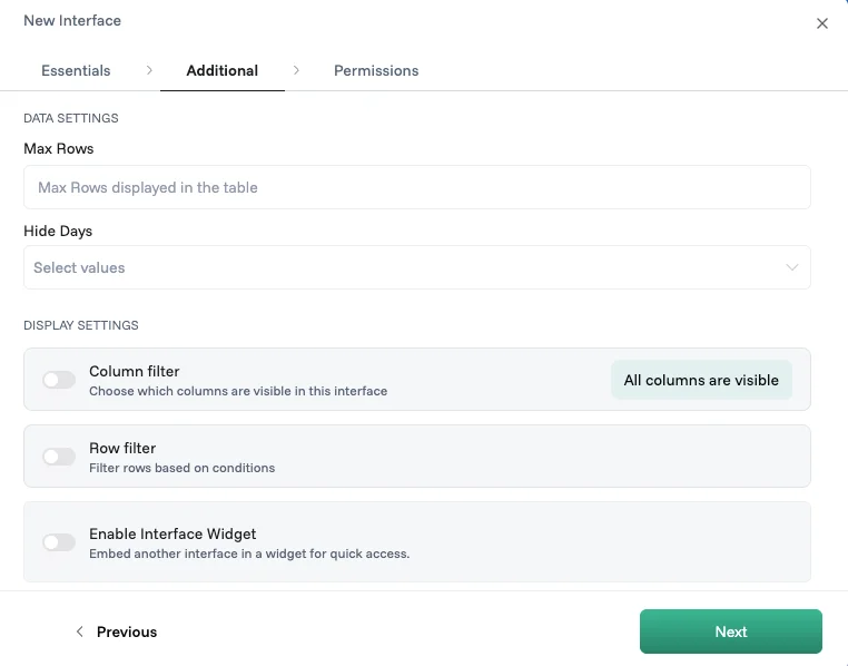
Data Settings
Max Rows — sets how many records the calendar loads at once.
Hide Days — select specific days of the week to hide from the calendar view, useful if your team only works certain days.
Display Settings
Column filter — choose which columns are visible in this interface; not every column needs to be shown, so focus on what's relevant for this calendar's purpose.
Row filter — set conditions that automatically limit which records appear, using the visual logic builder; for example, "Assigned To equals Logged in User" shows each person only their own appointments. Learn more in the Logic Composer.
Enable Interface Widget — embed form interface in a widget for quick access alongside the calendar.
Click Next to continue.
Step 3 — Permissions
Read Access — assign which roles can view this interface; if no roles are assigned, everyone in the workspace can see it, but once a role is added only that role has access.
Write Access — assign which roles can add, edit, or delete records in this interface.
Click Update View to save your interface.
Note: These settings are configured by admins and cannot be accessed by any other roles.
Working with your calendar
1. Slice your data
The filter panel on the left shows columns that share repeated values — like Status, Assigned To, or Type. Select one or more values to narrow down which events are shown on the calendar. Combine filters across columns for a more precise view, and click + Add Slice to create a custom filter using the Logic Builder and save it as a reusable slice.
2. Quick filters
Quick filters sit above the calendar as tabs, giving you one-click access to common views without touching the filter panel.
Show All — removes all active filters and shows every record on the calendar.
New — shows records created within the last N days; you set the day range in Manage Quick Filters.
Active — shows records modified within the last N days; you set the day range in Manage Quick Filters.
Mine — shows only records where you are included as a team member.
To toggle which quick filters are visible or adjust their day ranges, click the filter icon next to the tabs to open Manage Quick Filters.
Click + next to the tabs to create a custom filter using the Logic Builder. Combine multiple conditions with AND/OR logic and save them as a named tab for repeated use.
3. Search
Use the search bar in the top right to find records instantly by keyword across your calendar.
4. Navigate dates
Use the left and right arrows next to the month and year to move backward or forward in time. Click This Month to jump back to the current period at any time.
You can also adjust the timezone shown in the calendar header to view events in a different timezone without changing your interface settings.
5. Switch views
Use the view switcher in the top right to change how your calendar is displayed:
Month — see all events laid out across a full month grid.
Week — focus on a single week with a more detailed day-by-day breakdown.
Day — zoom into a single day's events with time-slot precision.
List — view all events as a scrollable list ordered by date, useful when you have many records close together.
6. View a record
Click on any event card on the calendar to open the full detail view of that record, where you can see all fields and make edits depending on your permissions.